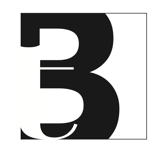
figure ground
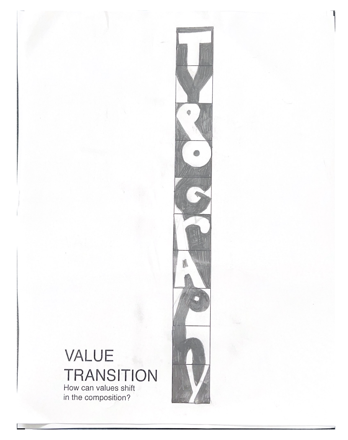
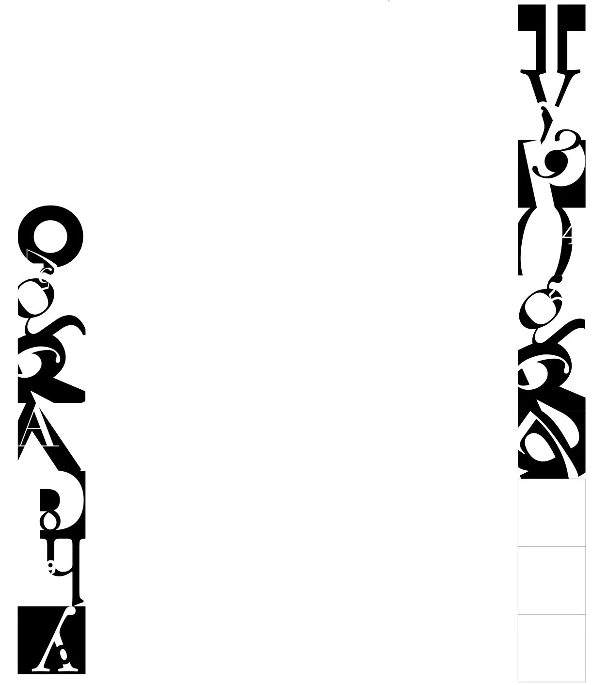
For this assignment, my design choices focused on flow and value, emphasising a successful connection from each letter to the next square. I aimed to ensure that each number complemented the corresponding letter and the overall composition. While I initially explored more font variation, I figured out that my composition worked much better using bold, non-serif fonts for the figure and serif fonts for the ground, which achieved a balanced and cohesive design. Overall, my design consistently flows throughout, and successful value transitions.

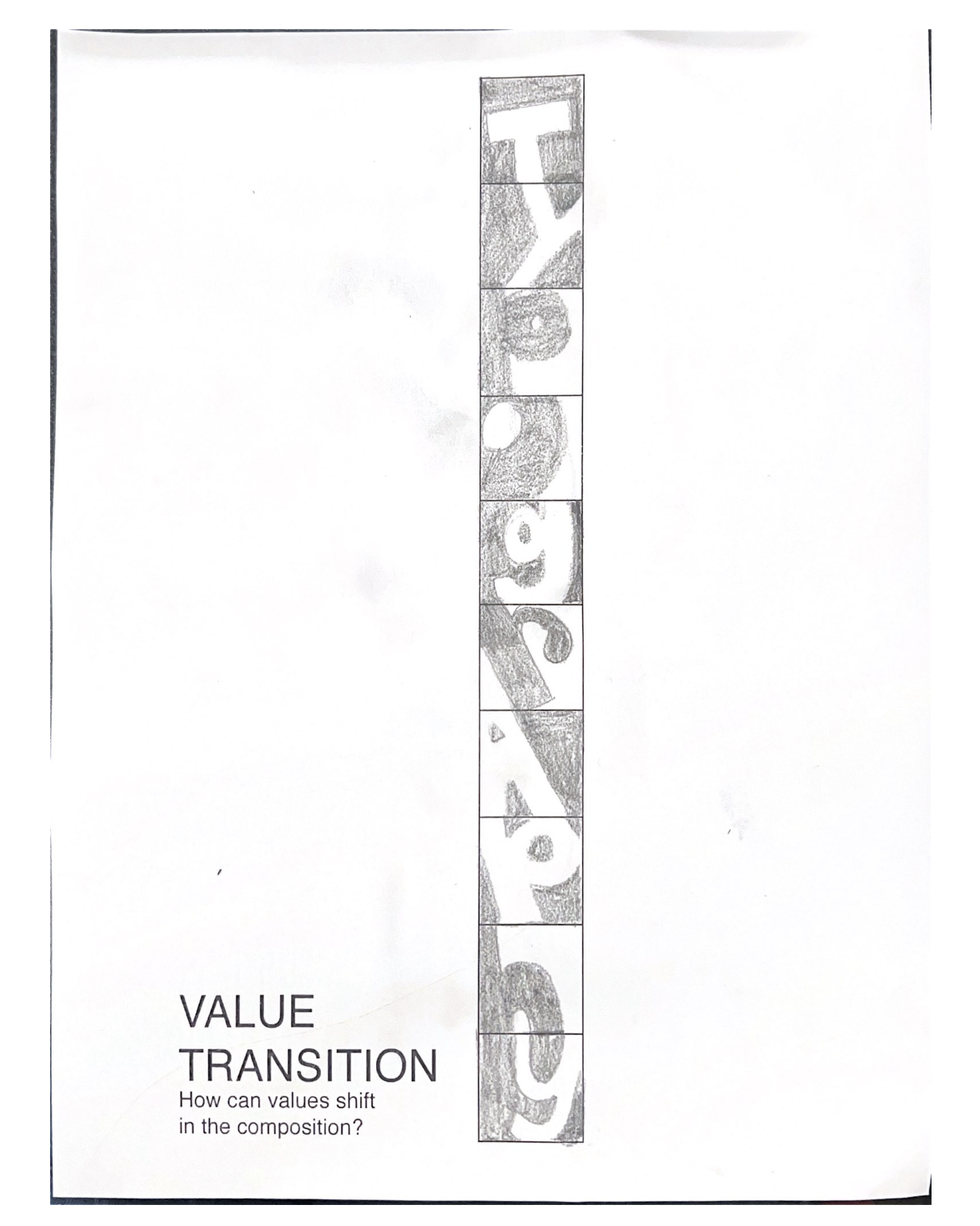
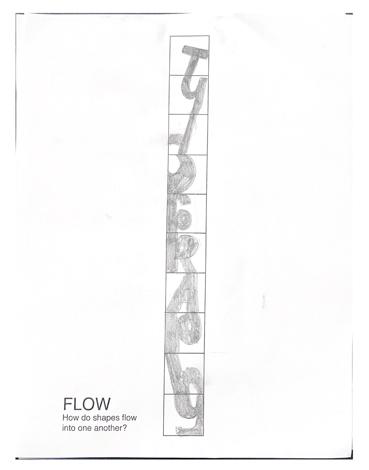
progress work