Menu
design
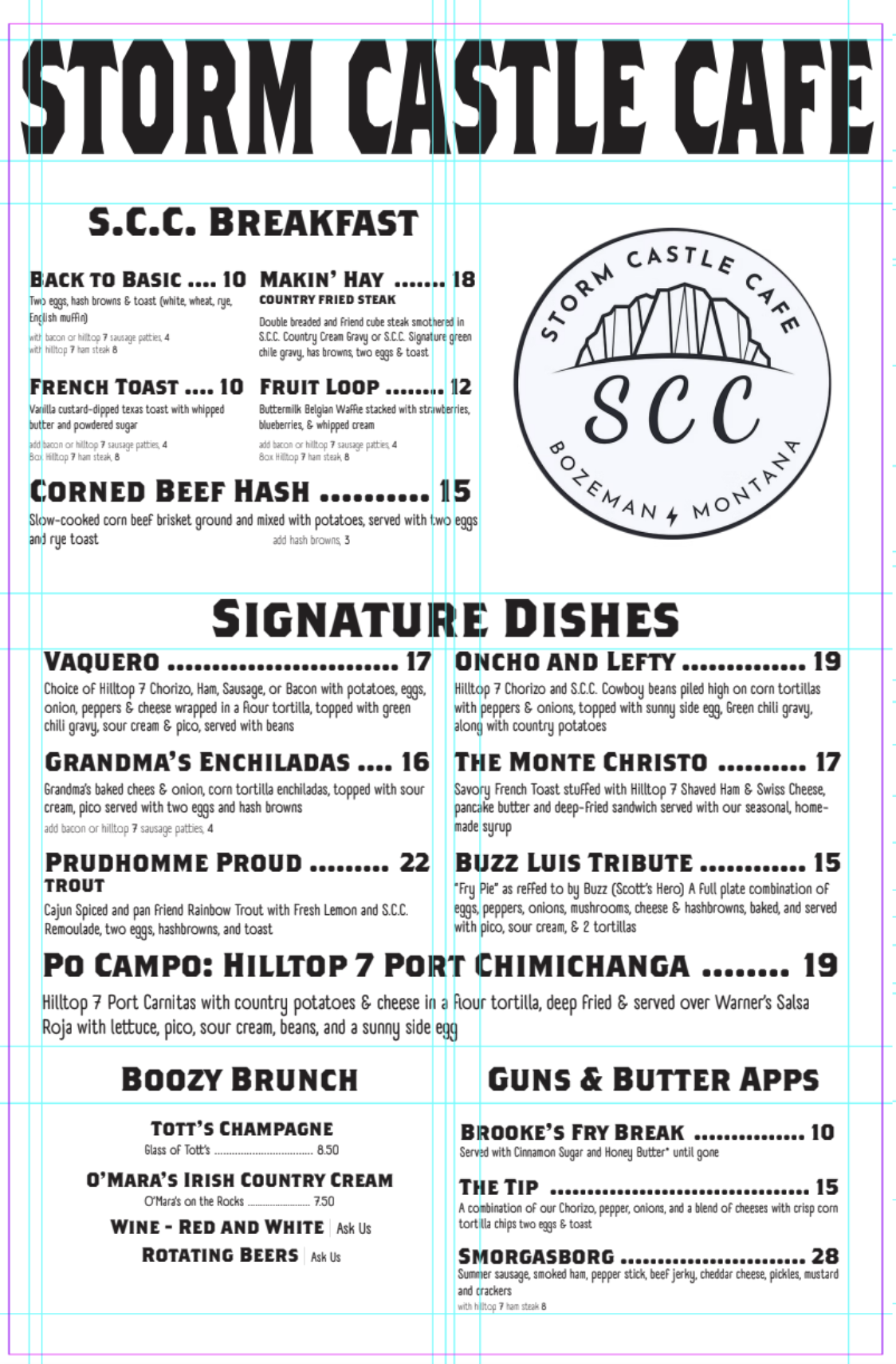
This assignment presented an intriguing typographical challenge, emphasizing typeface selection and precision. After numerous attempts, I found the perfect pair to evoke the warm, inviting atmosphere of Stormcastle Cafe: Brothers OT and A Day Without Sun. The bold headings of Brothers OT enhance warmth and readability, while the handwritten style of A Day Without Sun injects authentic diner character into the layout. Crafting a coherent, chronologically sensible, and grid-consistent design was the most demanding aspect of the process. Although it was arduous, I am very pleased with the outcome. The logo posed additional difficulty due to its distinct typeface, which diverged from my chosen fonts. To address this, I outlined the logo and treated it as a badge rather than a traditional logo, enriching the overall diner aesthetic of the menu.
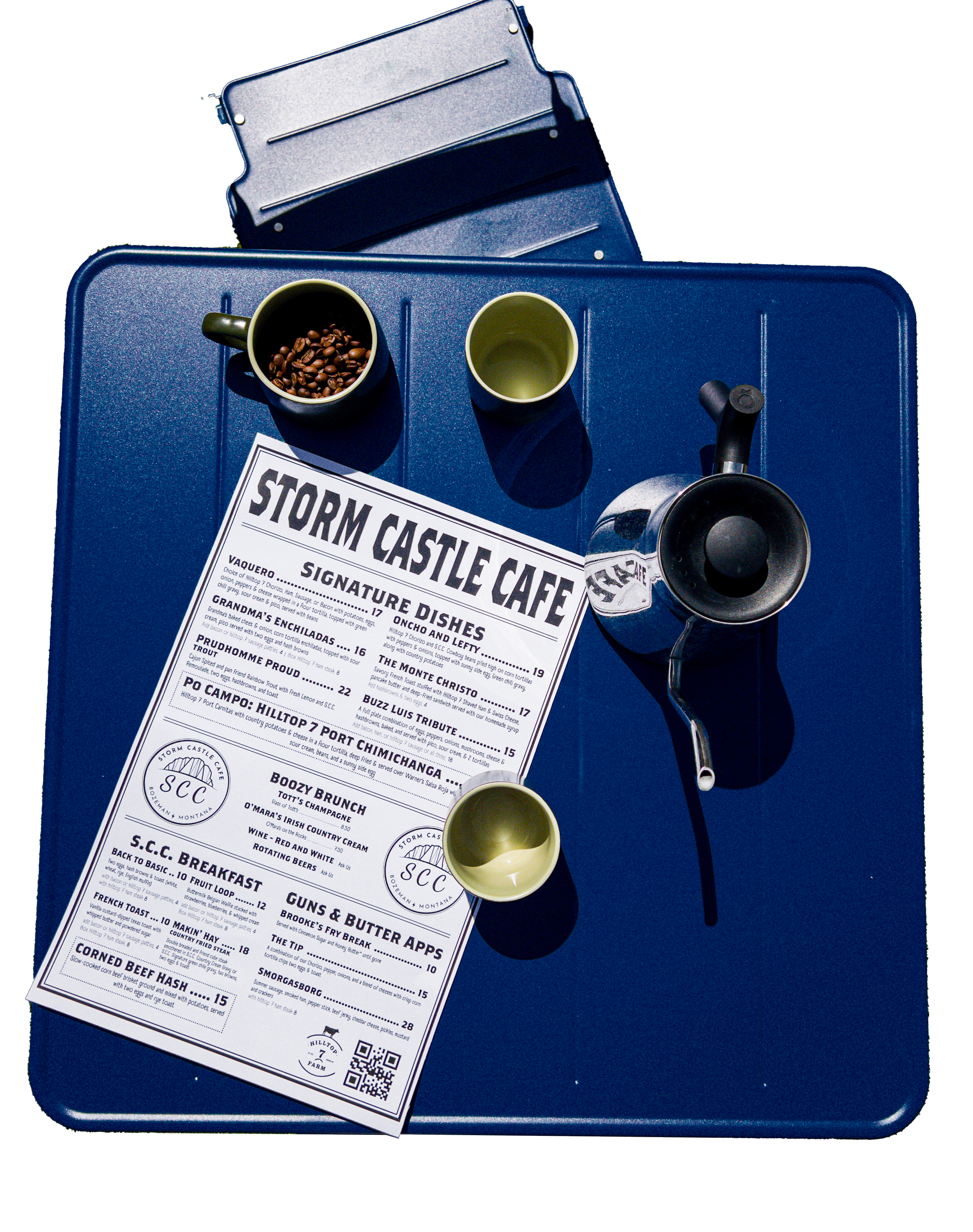

progress work