type poster
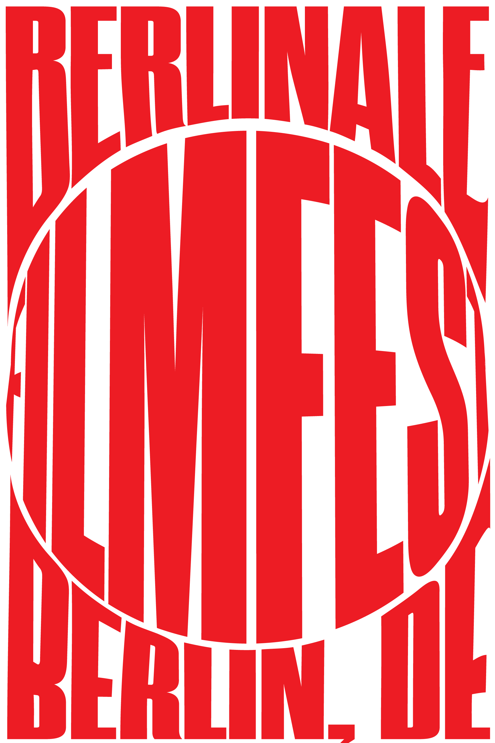
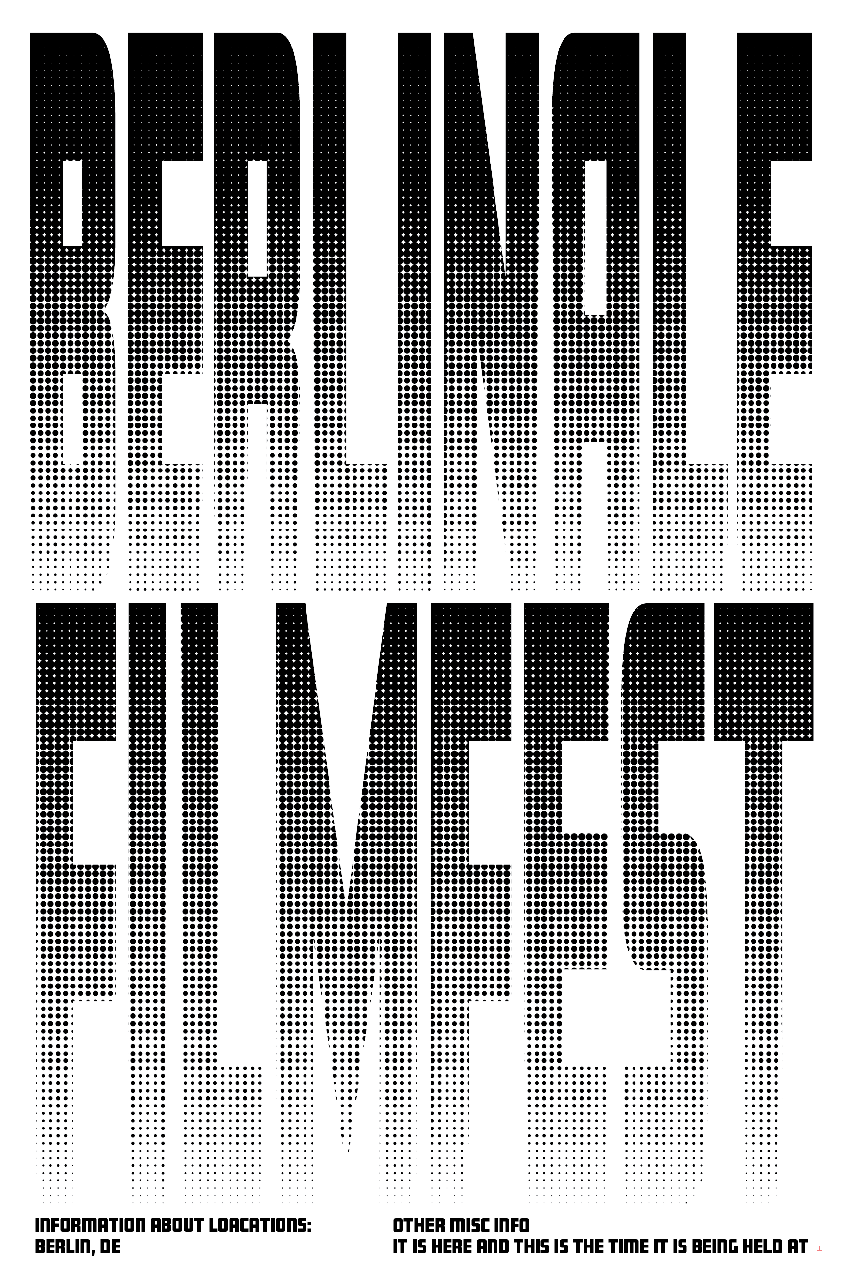
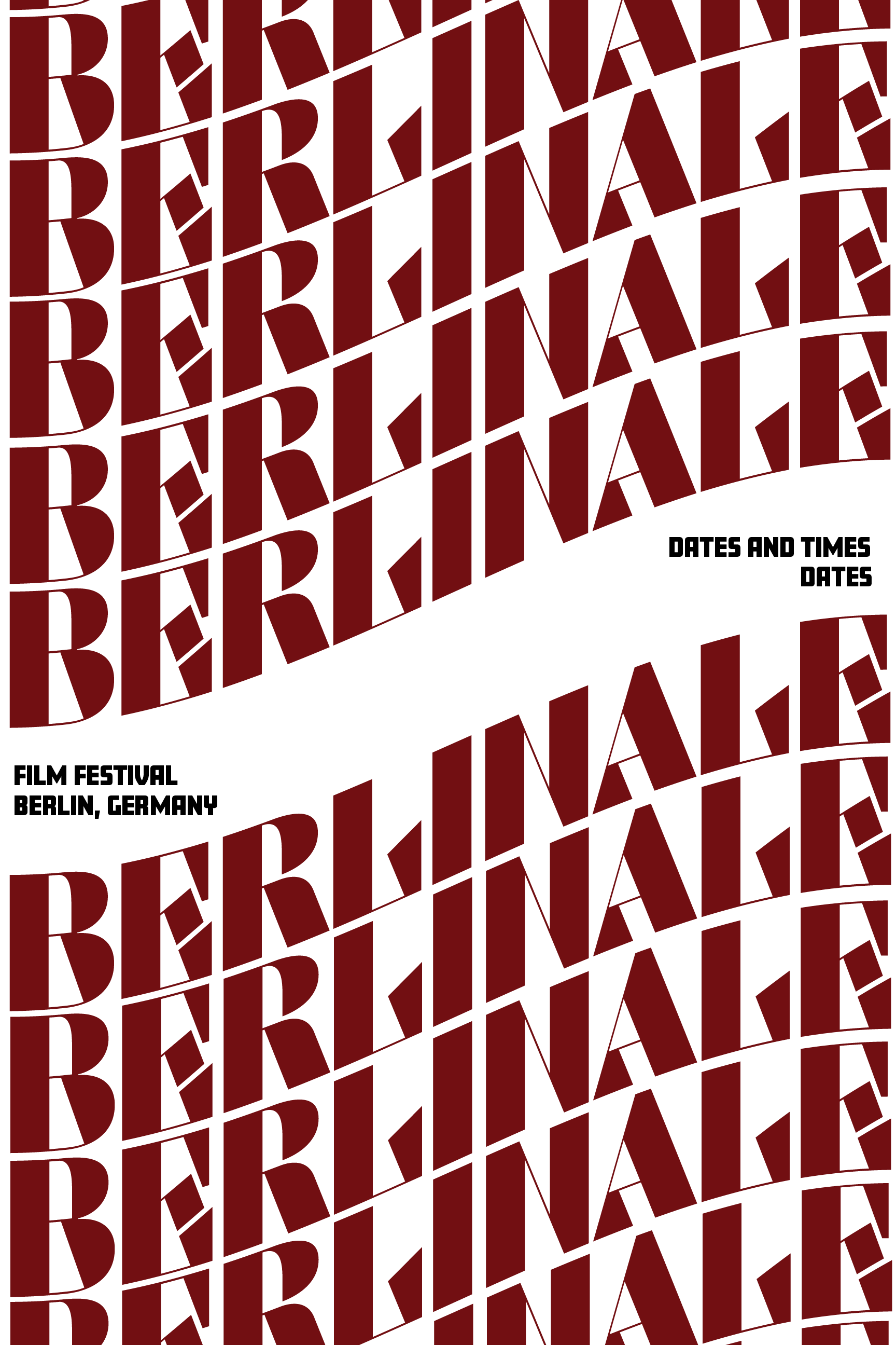
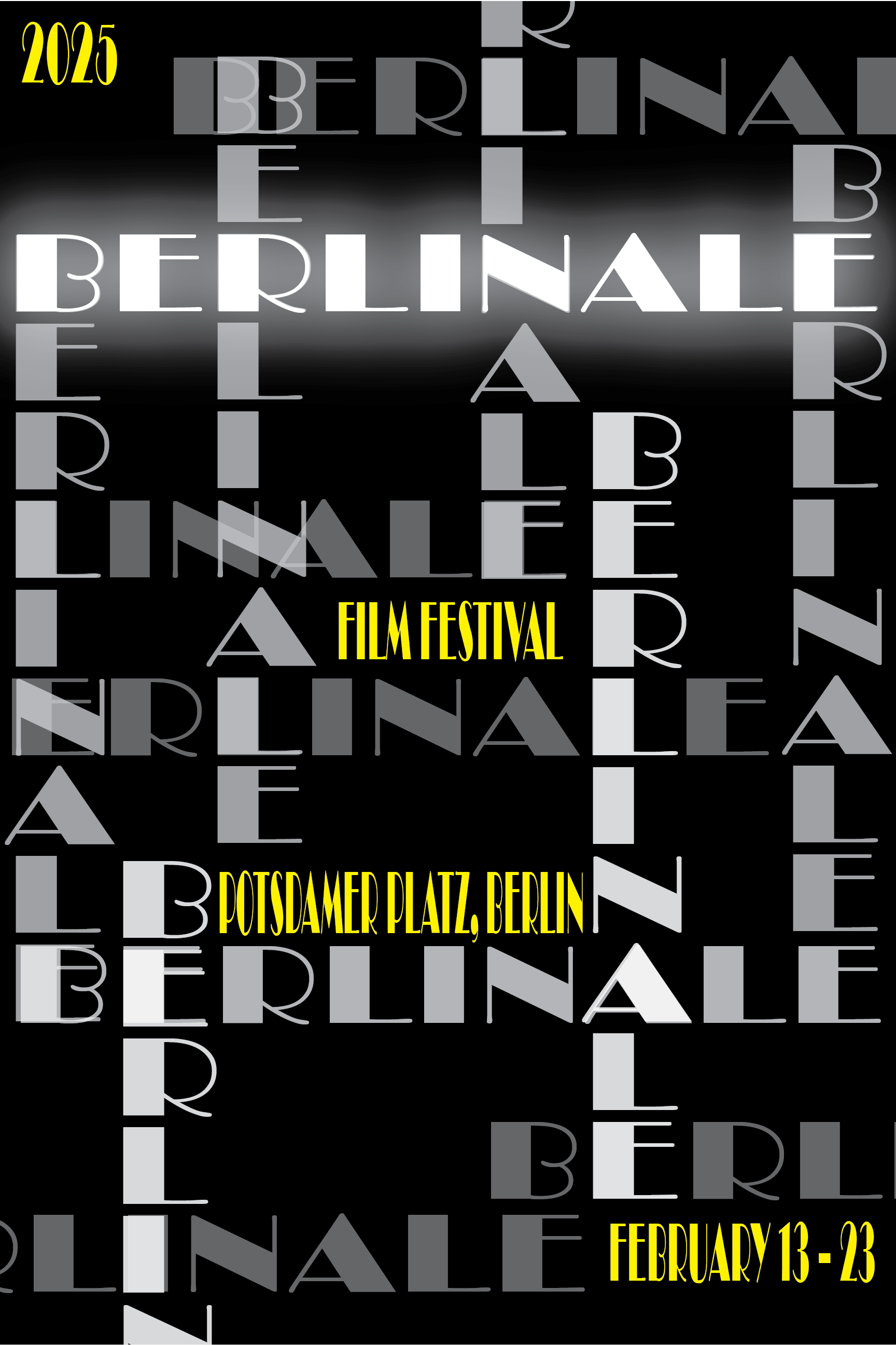
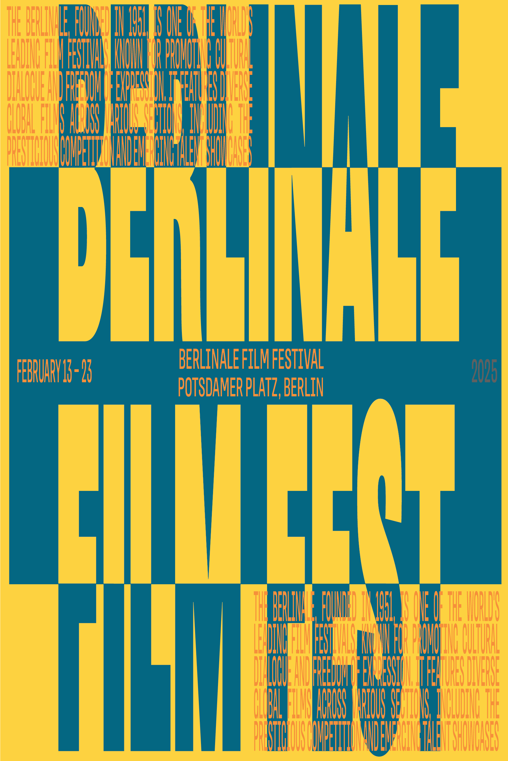
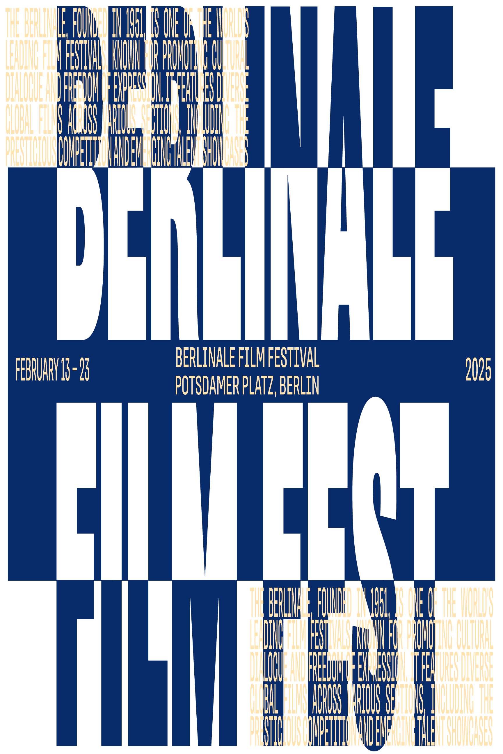
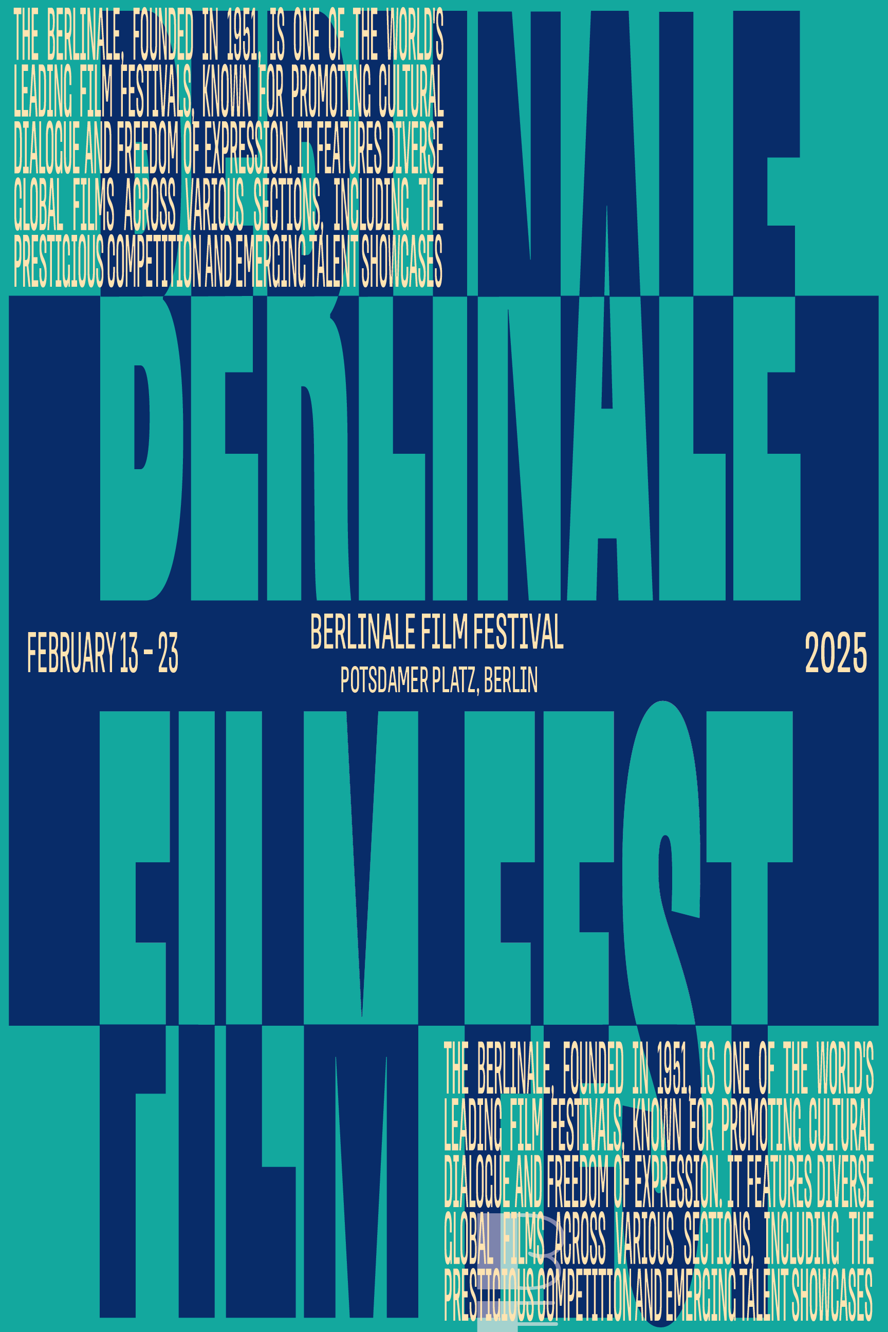
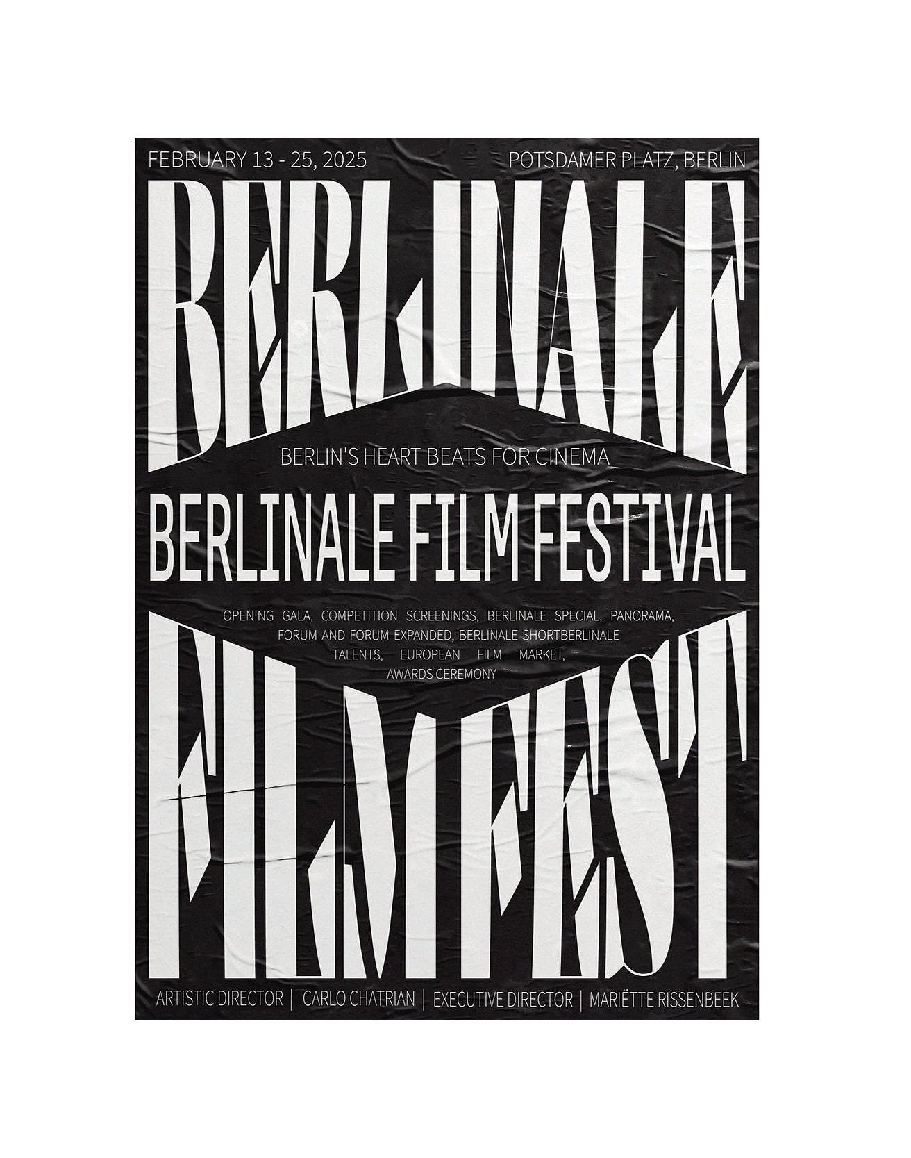
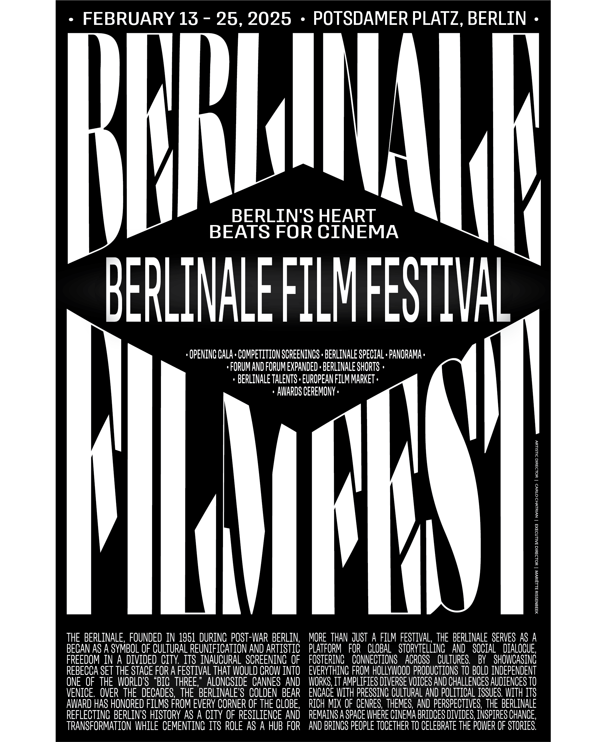
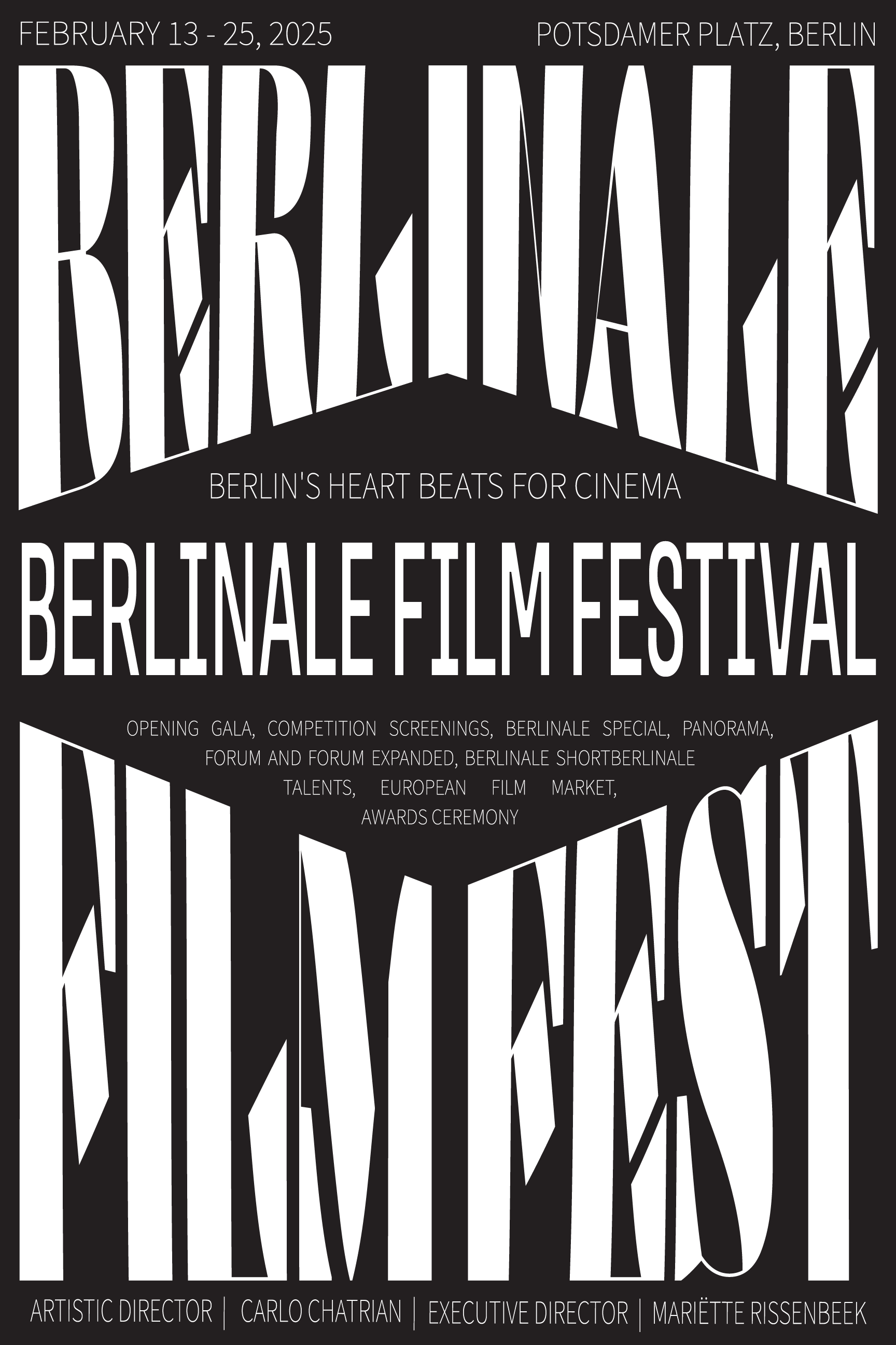
For my project, I chose to focus on the glamour of Hollywood and the competitive spirit of the Berlinale, a prominent European film festival known for its global storytelling and prestigious entries. My design reflects the event's classic elegance through a black and white palette. Inspired by old Hollywood, the typeface features a modern twist with striking serifs, while a diamond shape symbolizes luxury and dynamism. To evoke a movie poster, I positioned the body text beneath the type manipulation, allowing the festival's prestige to take center stage. I chose a simple, non-serif font, creating a clear hierarchy through size and spacing. A glow-like texture enhanced the title and body text, capturing the bright, celebratory essence of the red carpet experience. In my revisions, I eliminated the backlight and lengthy text to improve readability from a distance. I restructured the center space to enhance clarity and optimize negative space. I also selected a softer black for the background color, which resulted in better print quality.
223 Version
224 Version
progress work