MAGAZINE REBOOT
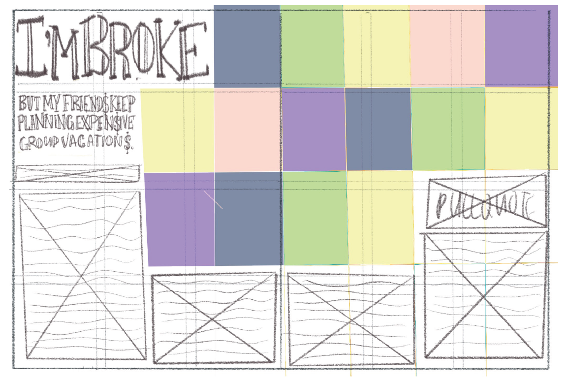
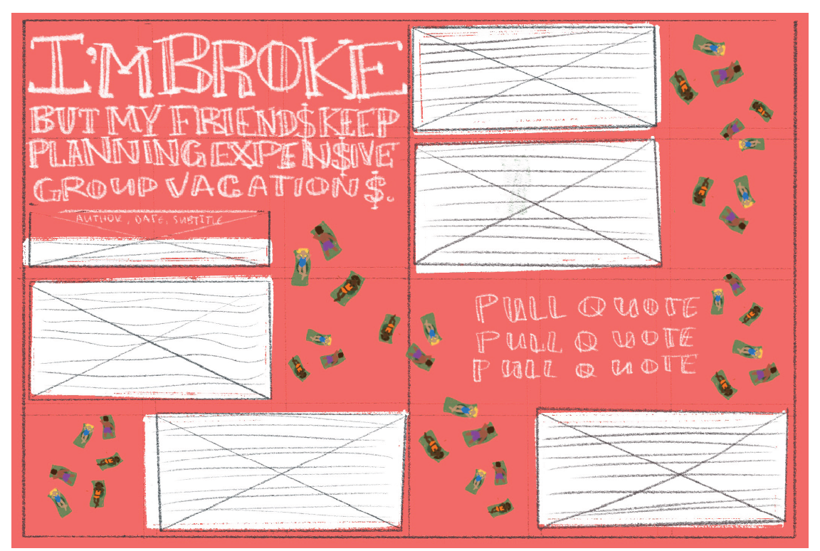
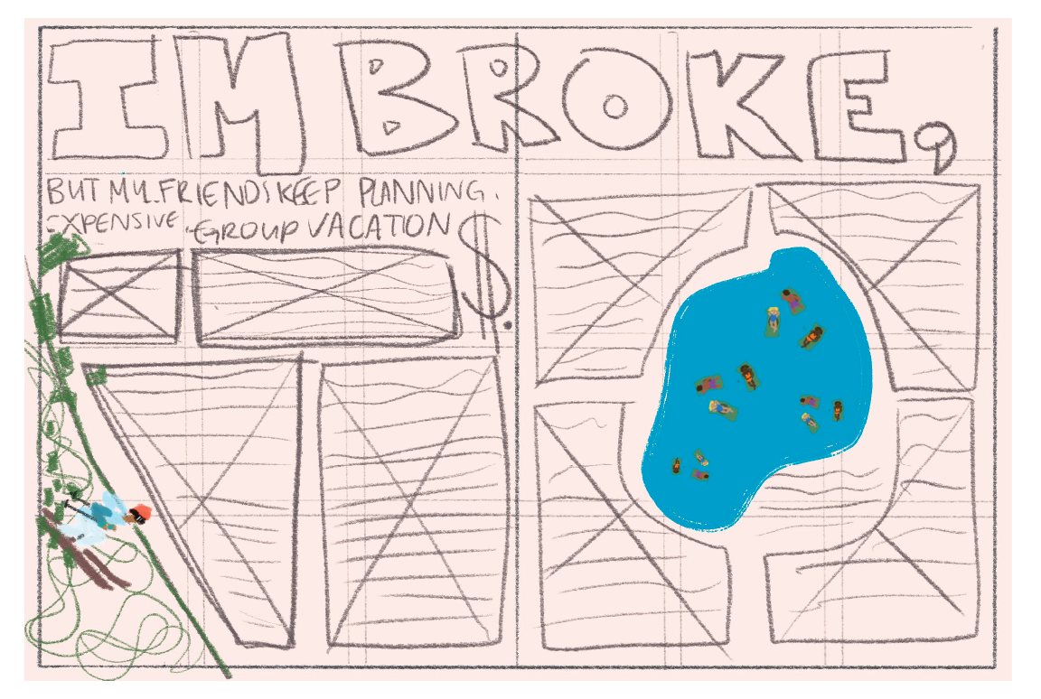
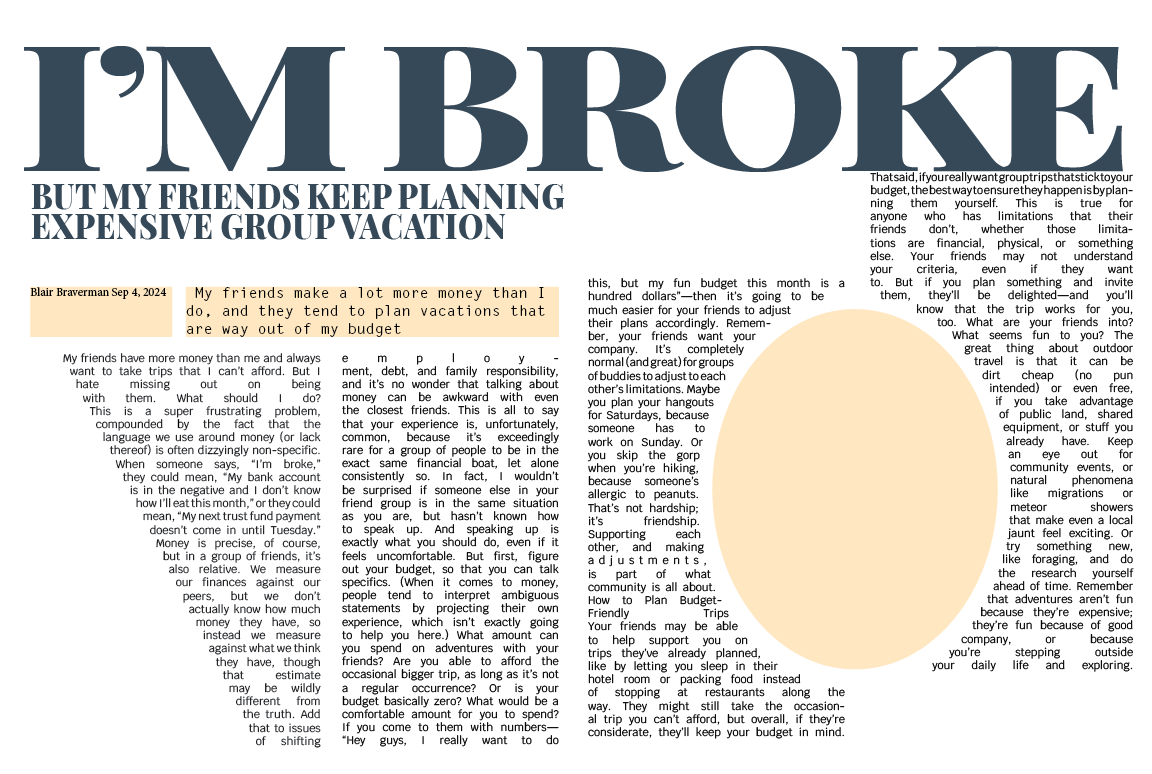
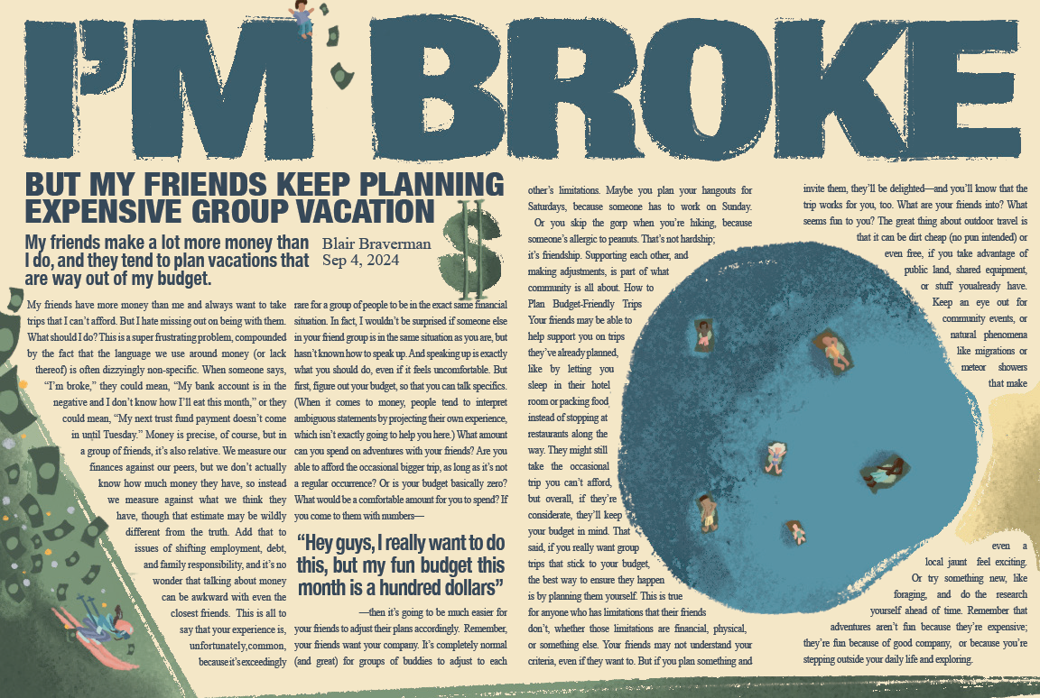
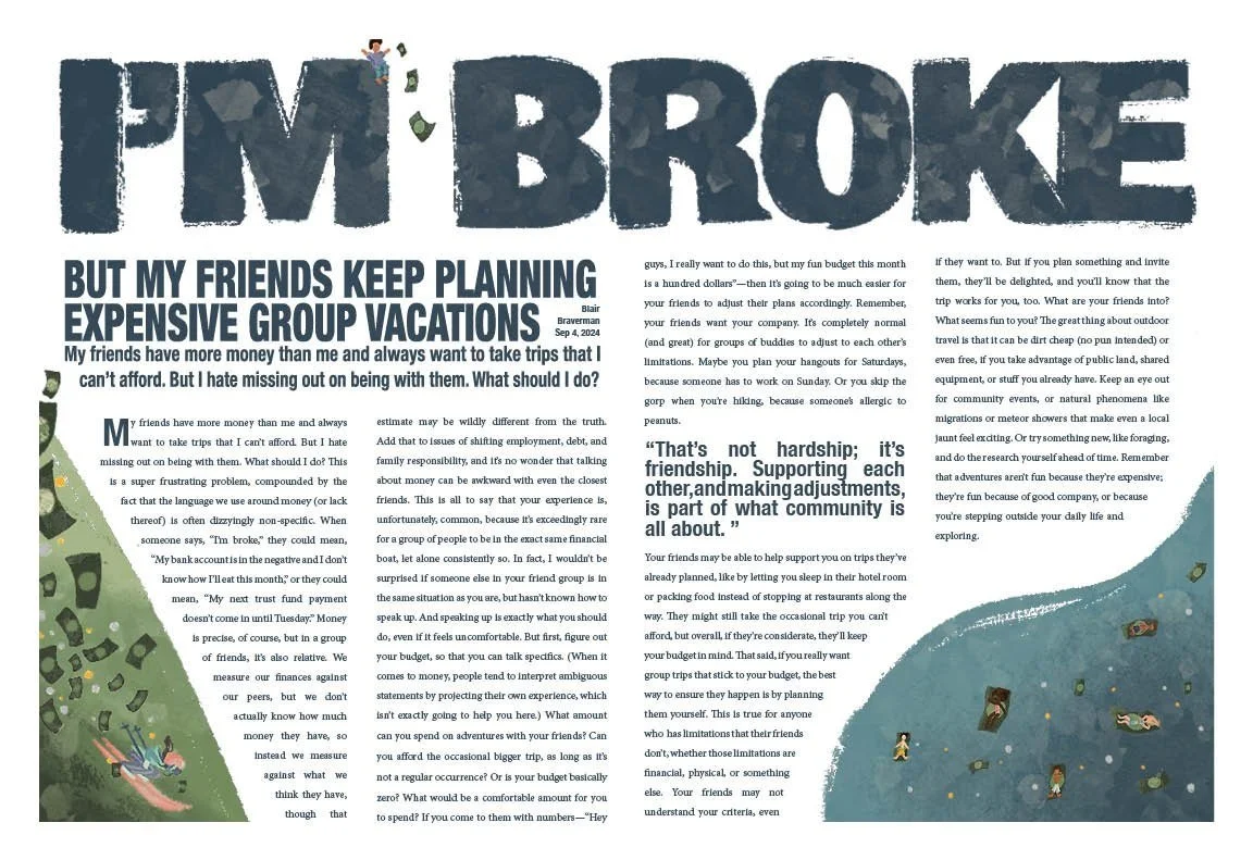
For this project, I focused on creating a very readable layout that displays visual hierarchy and incorporates a strong illustrative element. I selected a bold and clear headline typeface, Helvetica neue condensed black, to immediately draw the reader’s attention. I then drew over it on Procreate to give it a more illustrated look, similar to the rest of the illustrations on the spread. I maintained balance over the two pages with careful alignment of text and images, creating a harmonious composition without overwhelming the page. I decided to justify all my text, which was a challenge, but I think it makes the whole thing just look a little nicer. To differentiate between my primary and secondary content, I varied the sizes of my illustrations, of the people and the money, to create a little bit of depth. My overall design was inspired by this travel bag my mom got me that has a white background with a bunch of little skiers on it. I wanted to reference that in my illustrations, and also add that element of money and cost, emphasizing how much vacation activities can cost.

progress work
