City Rebrand
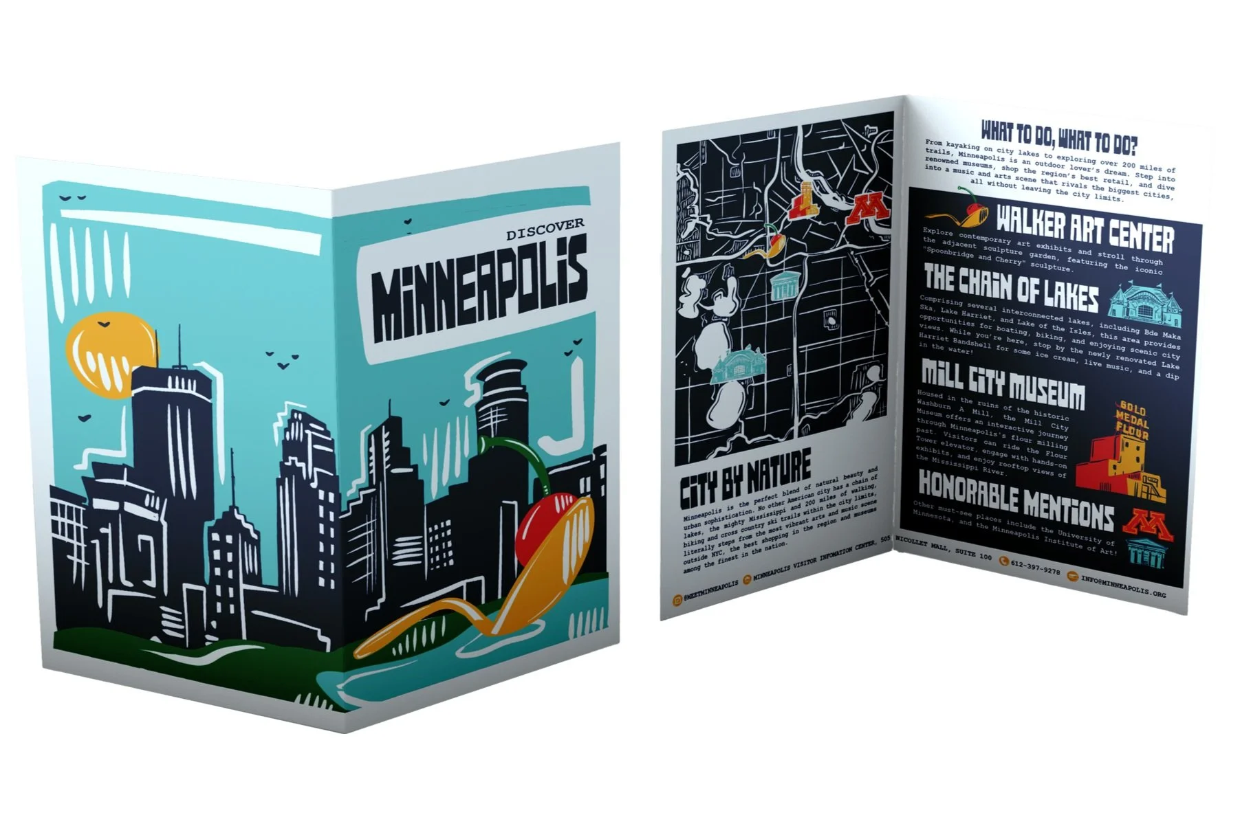
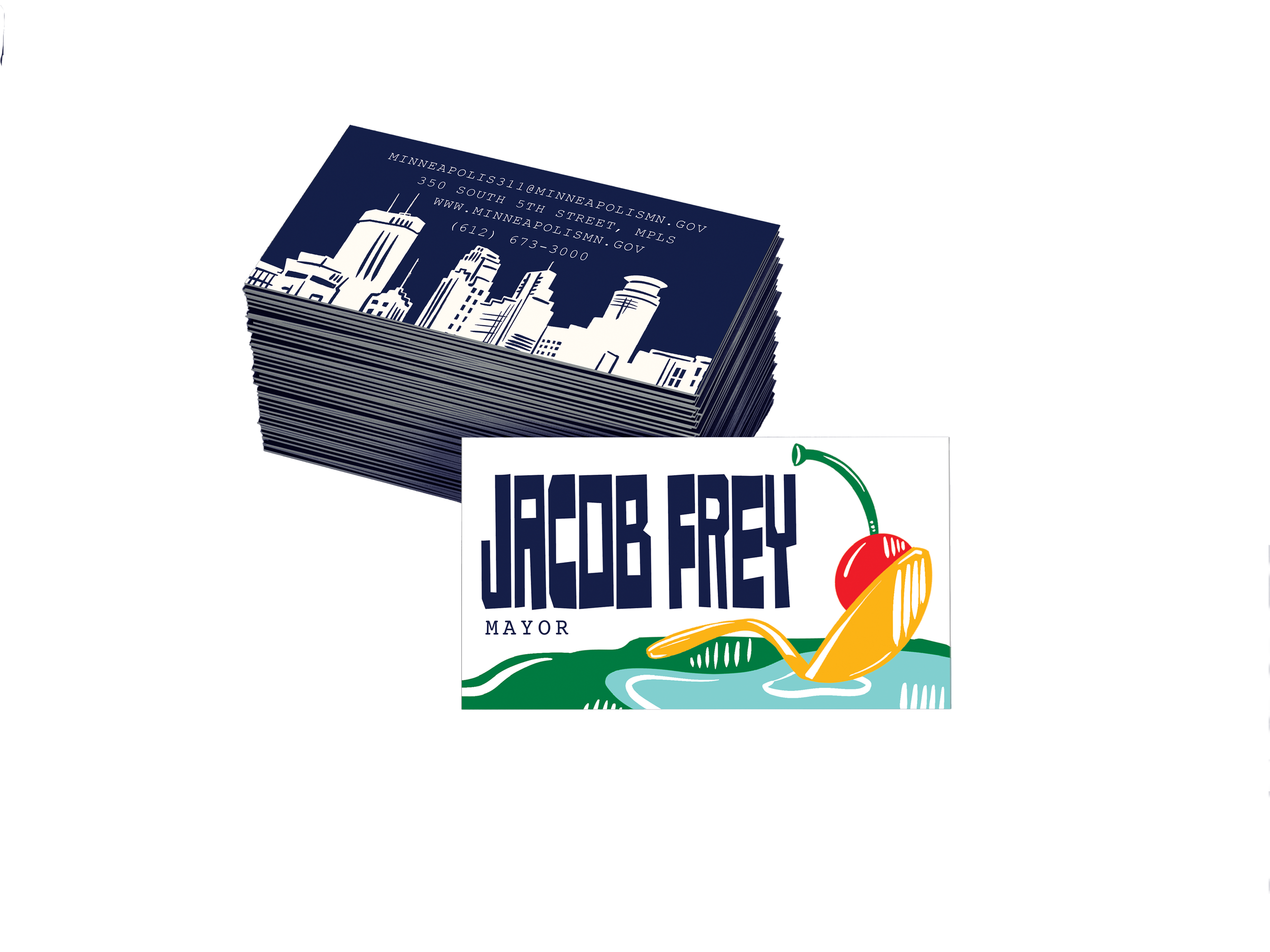
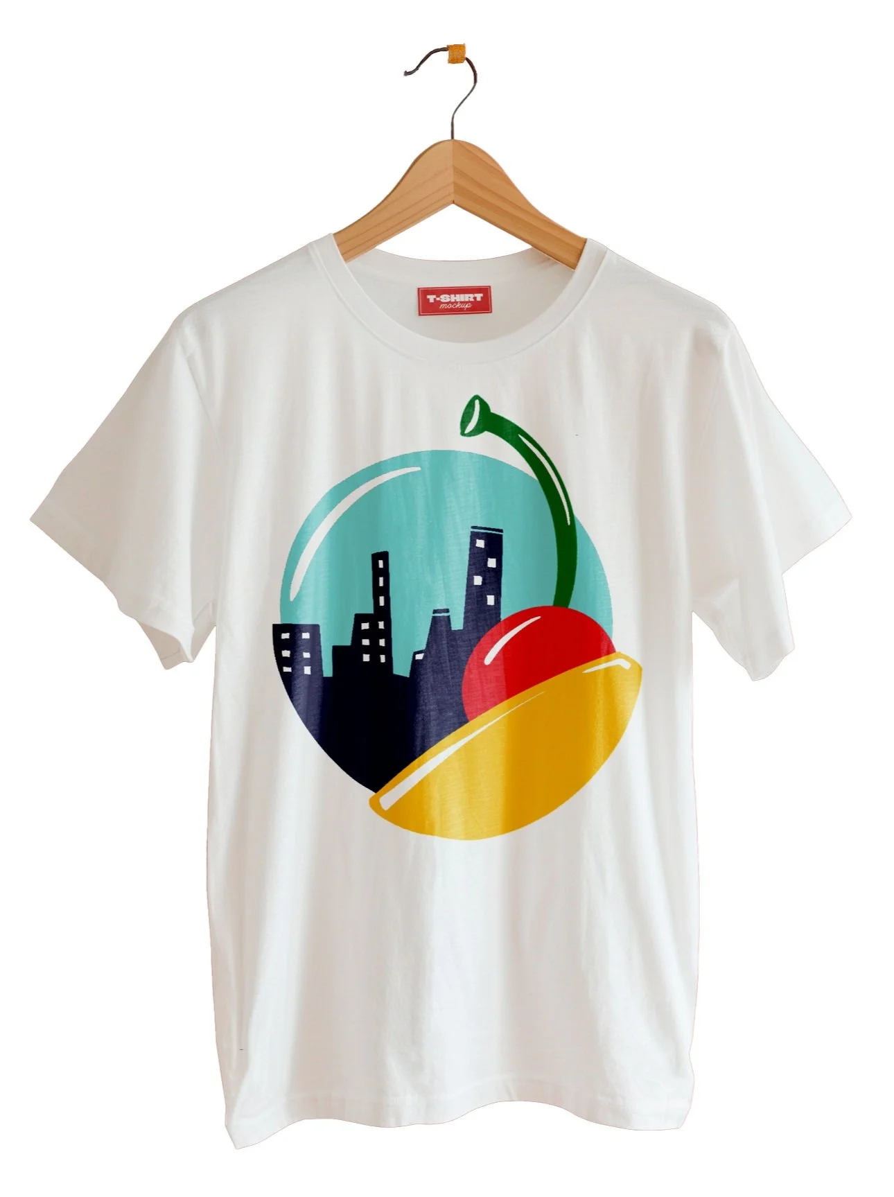
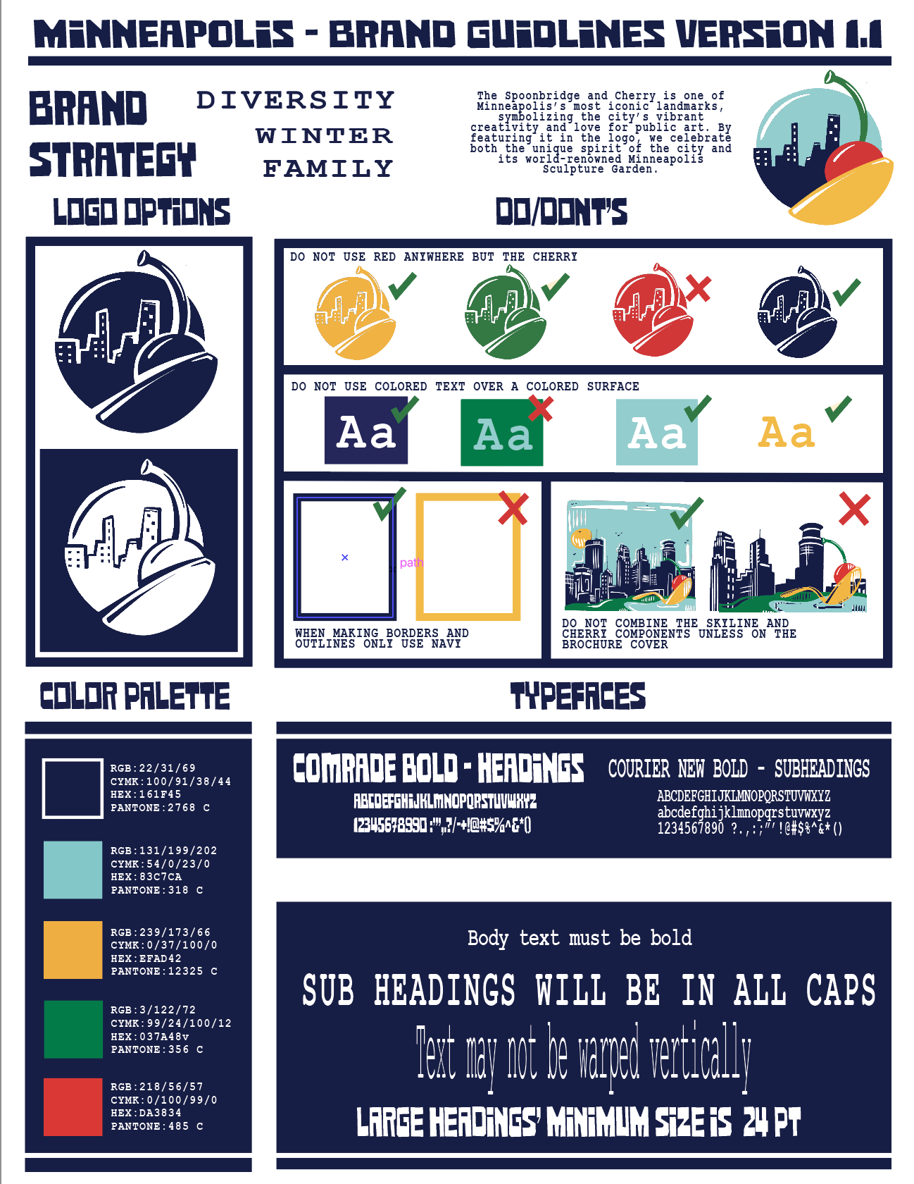
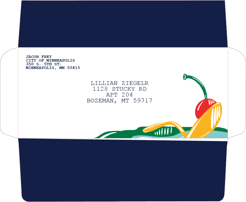
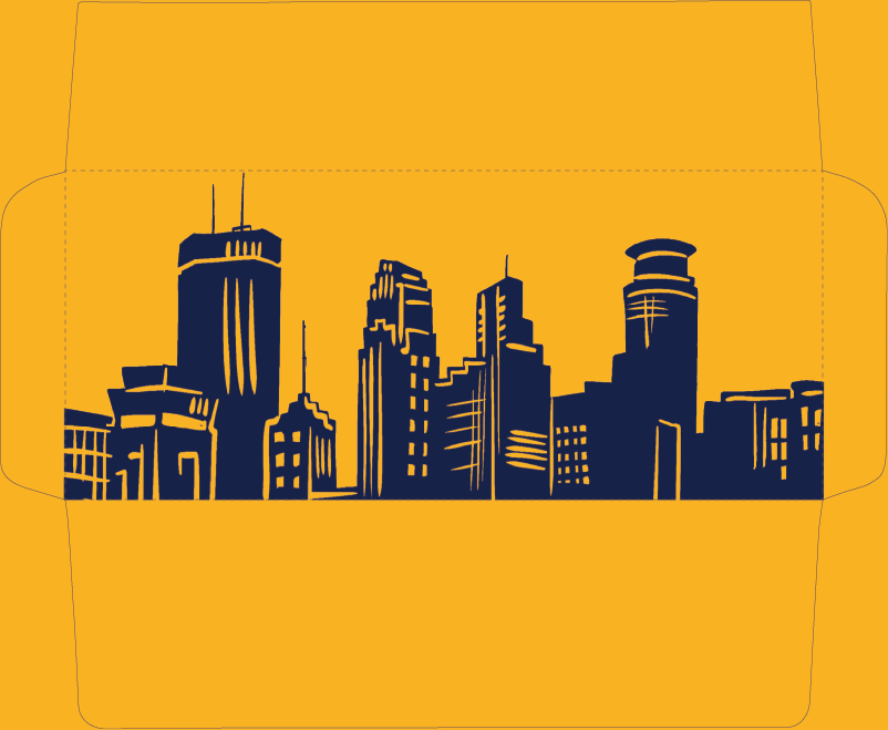
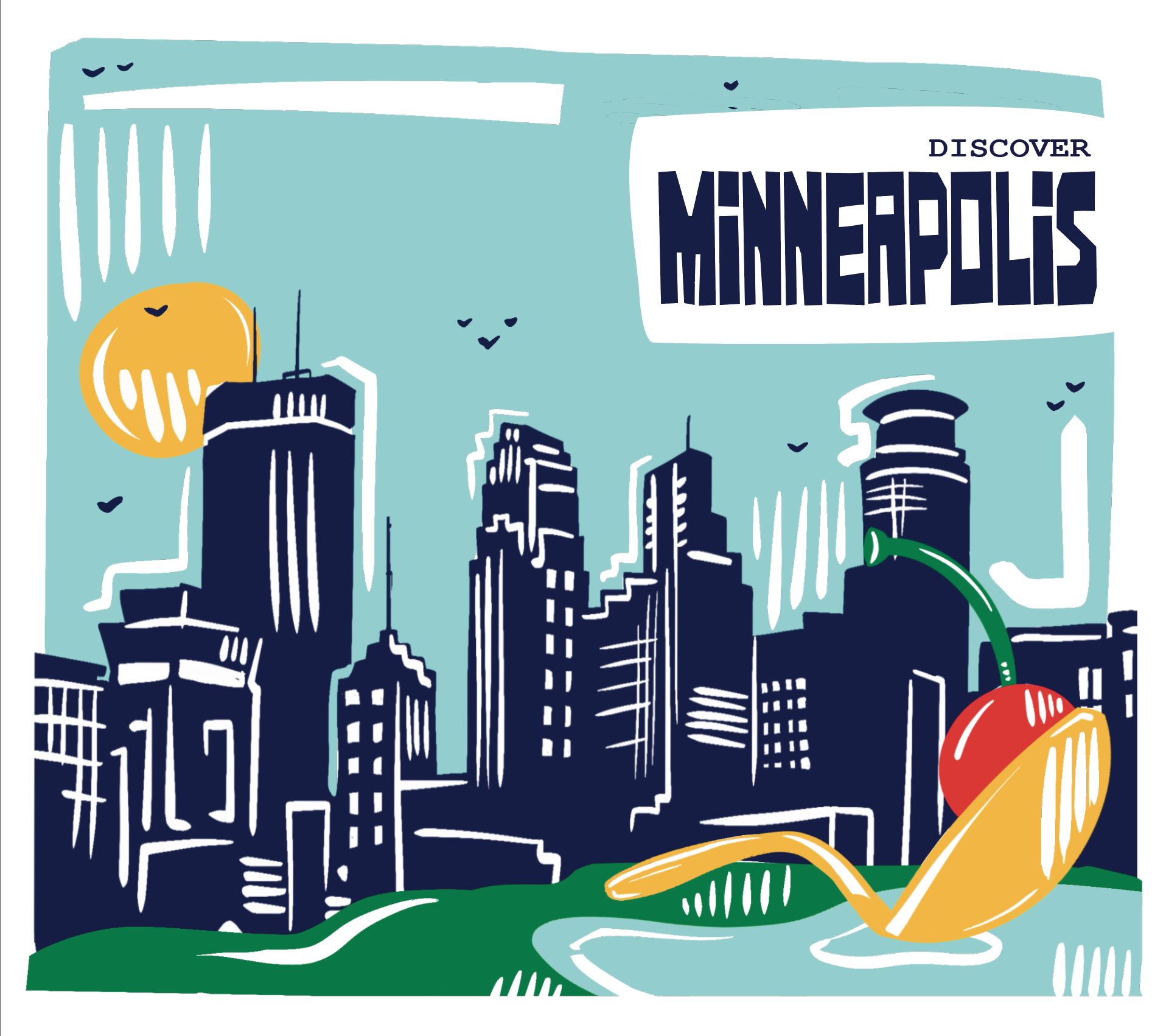
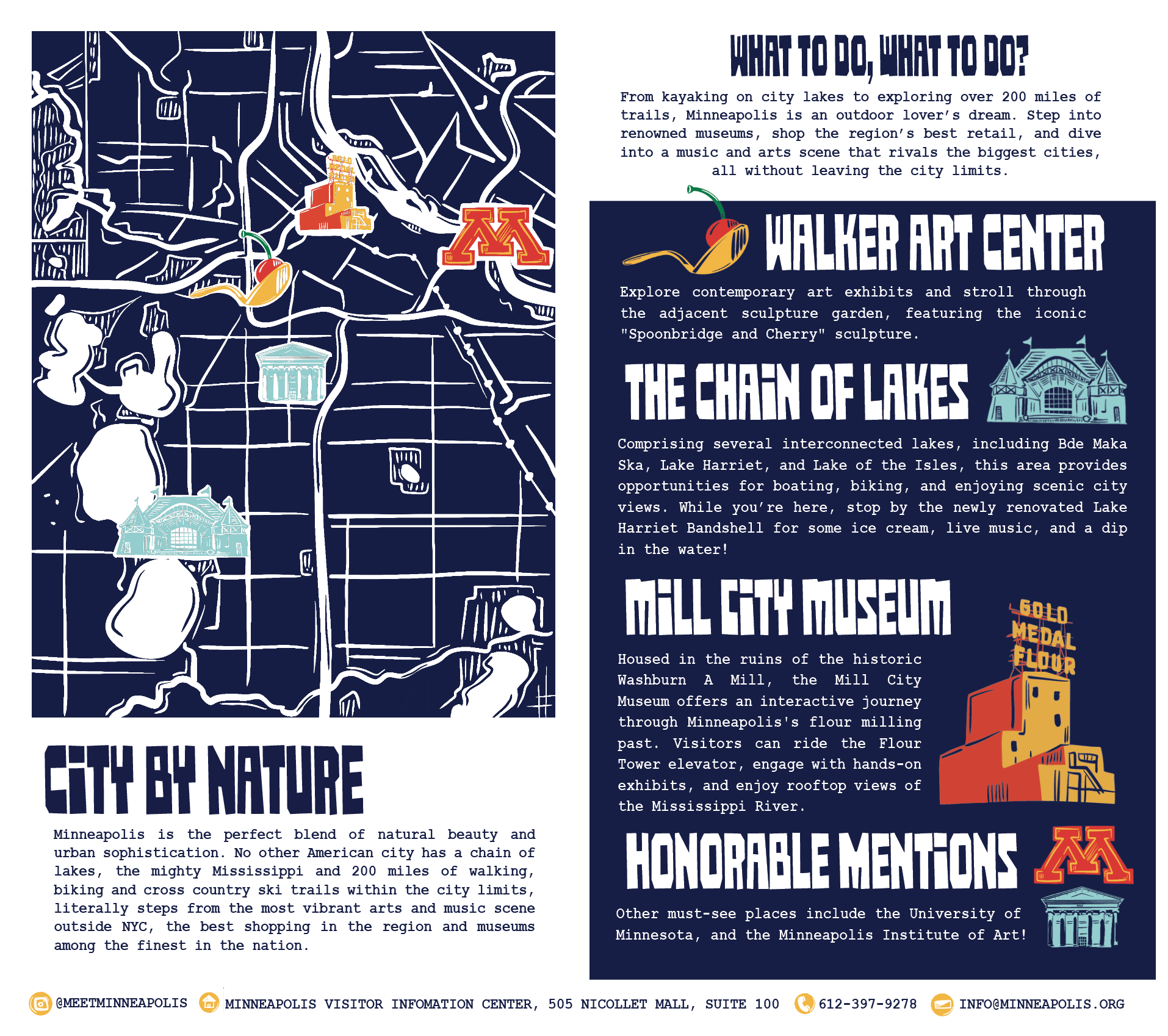
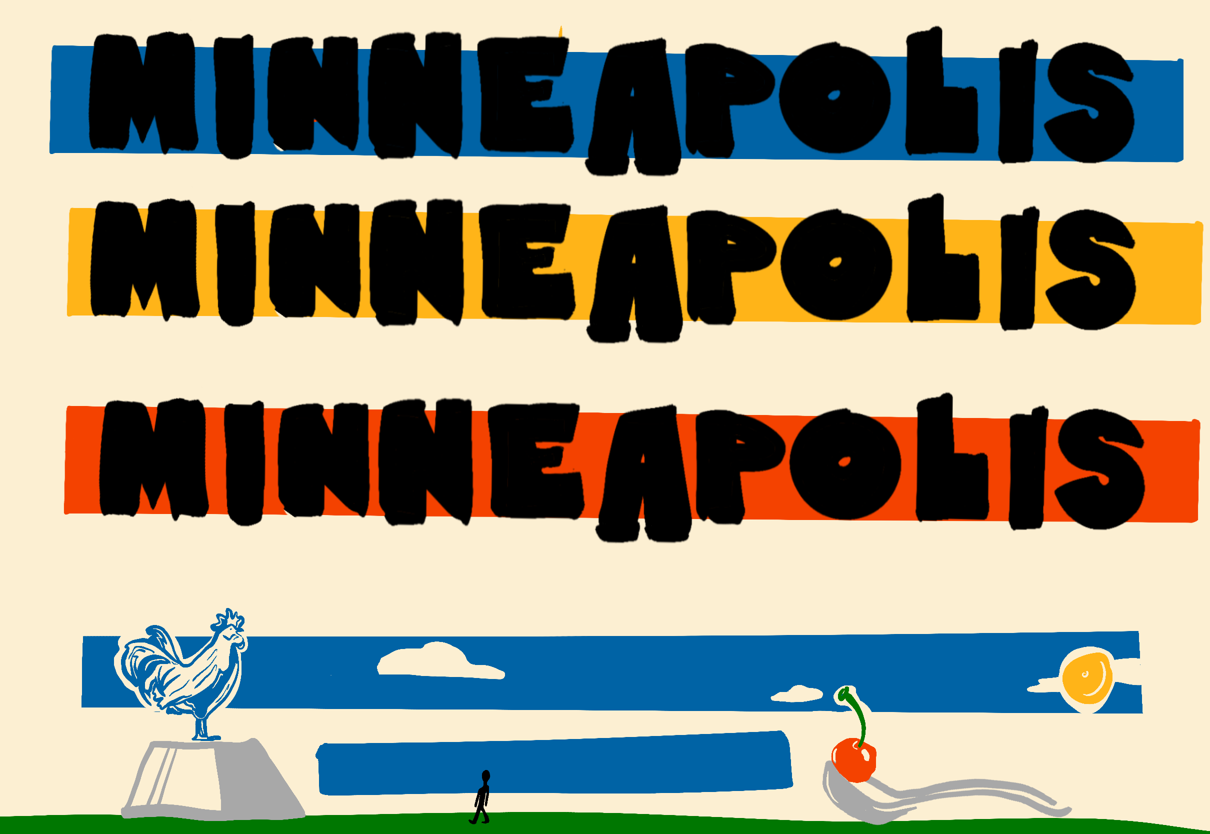
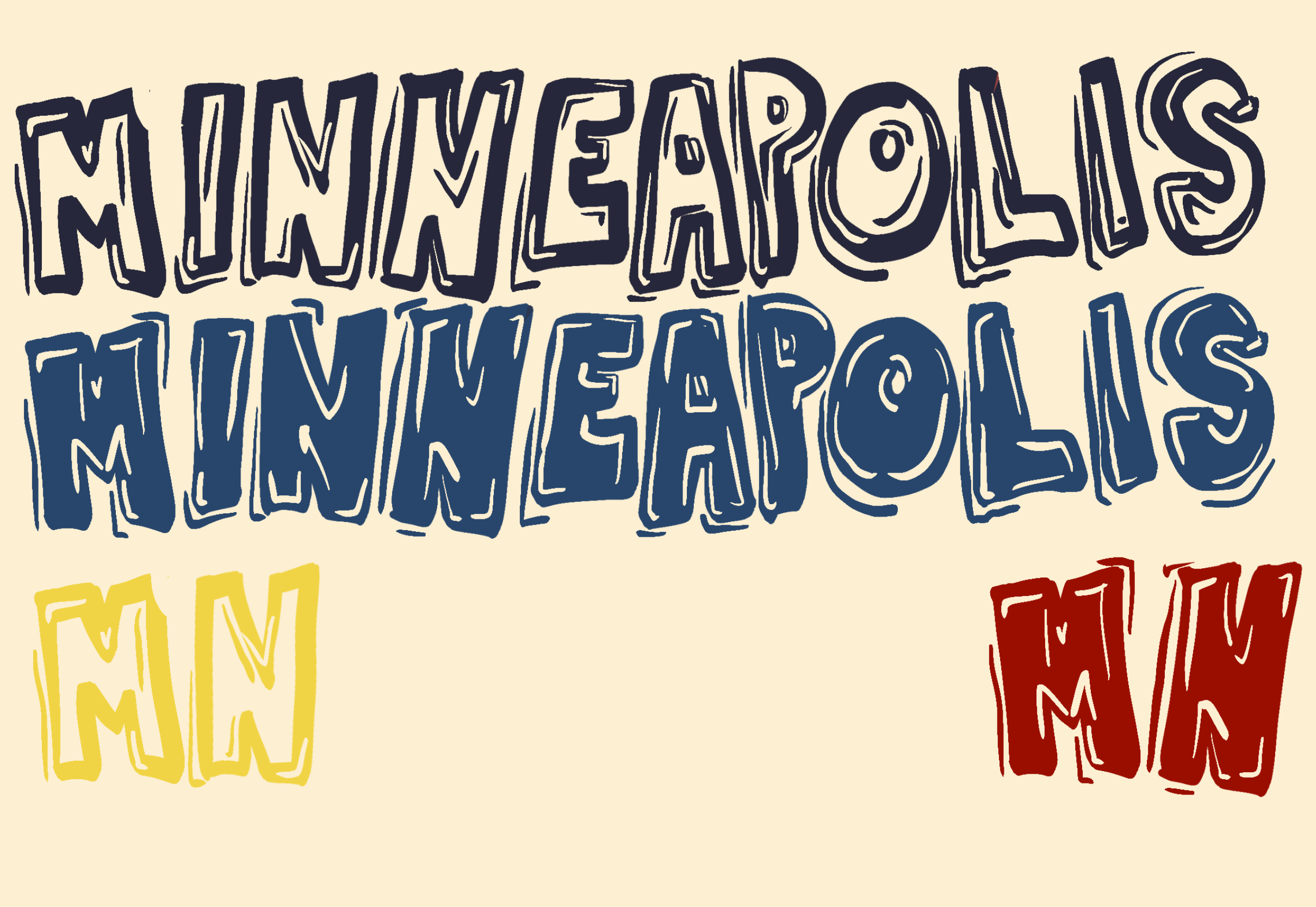
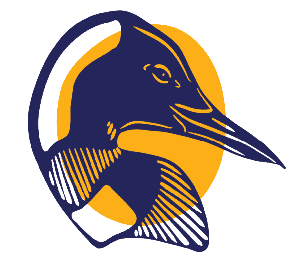
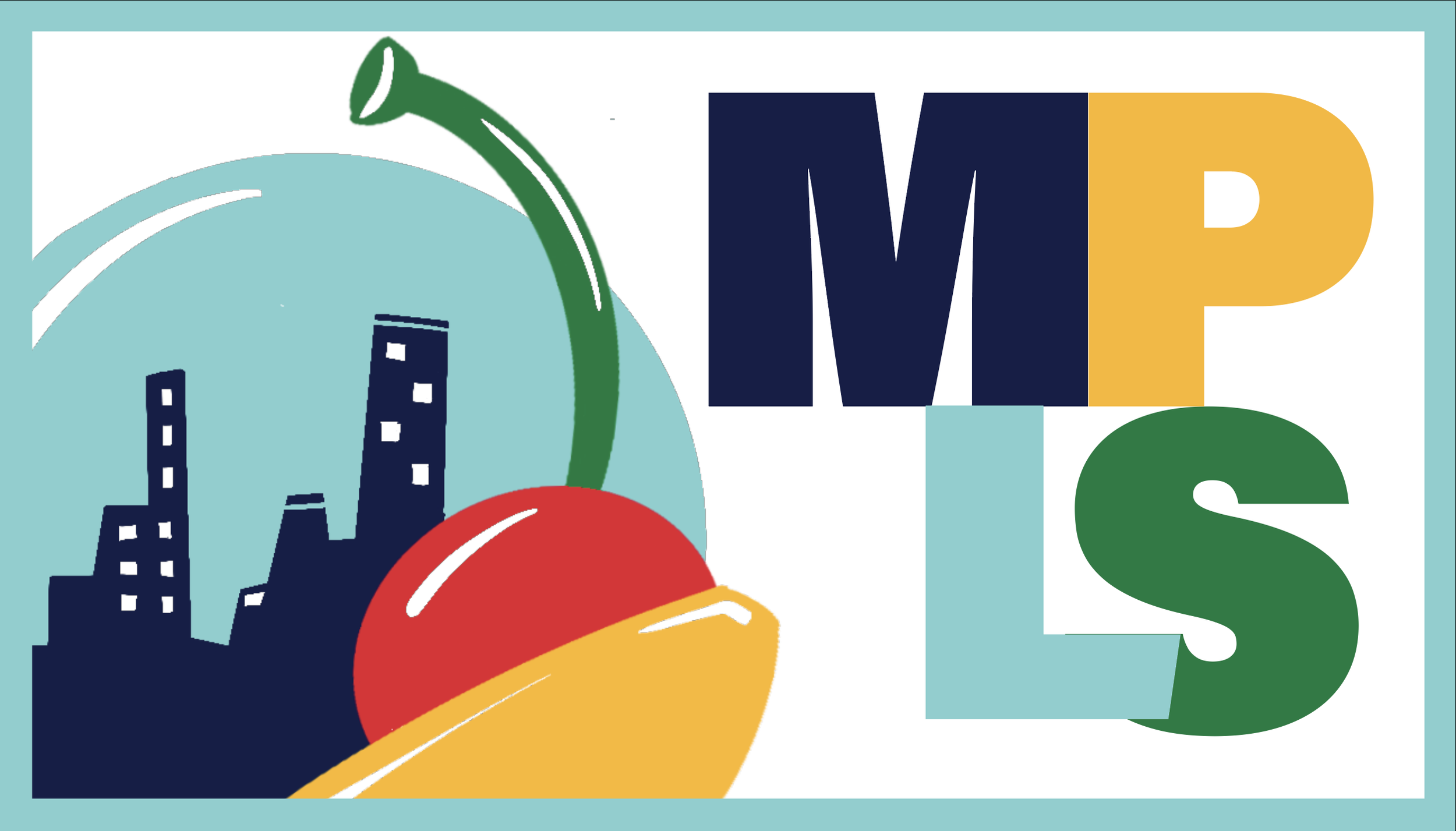
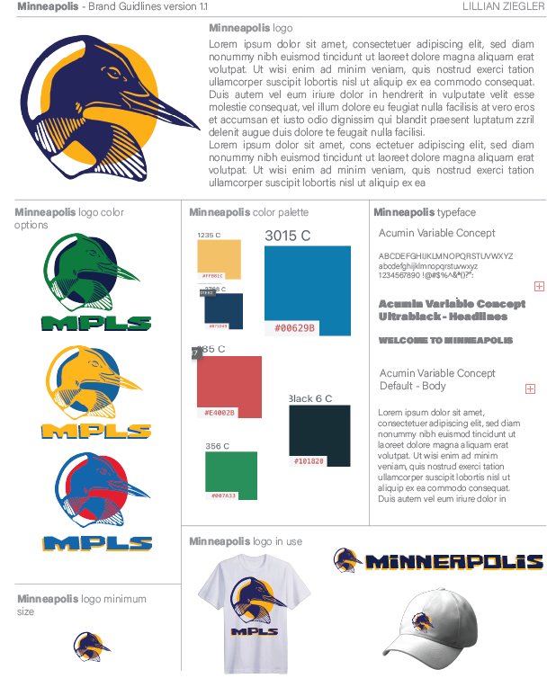
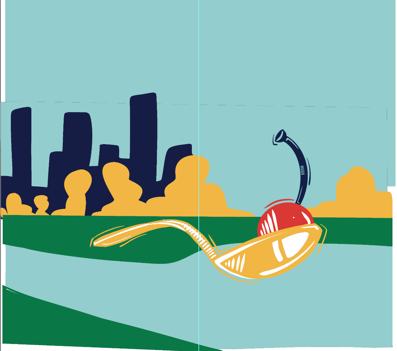
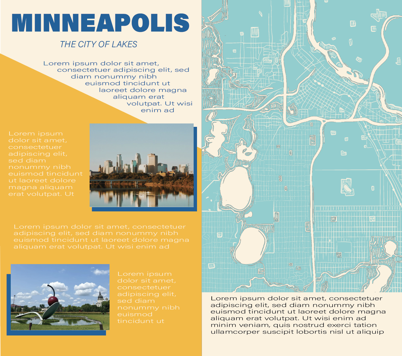
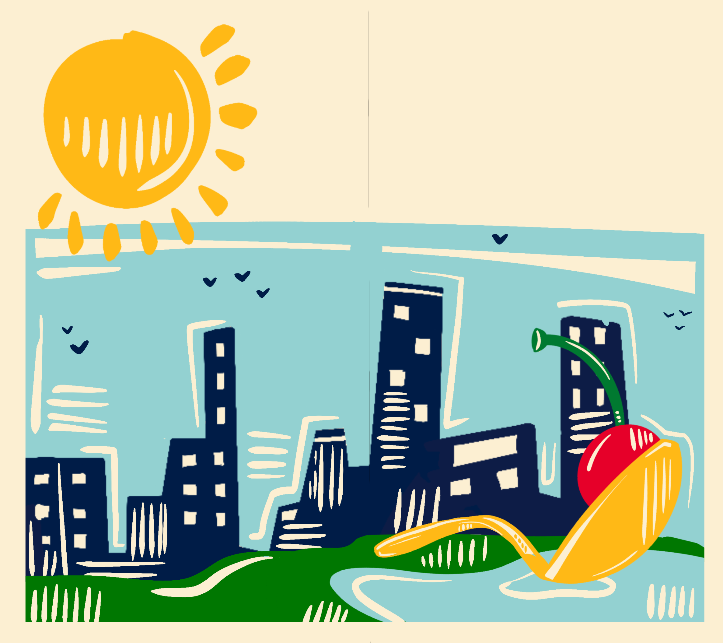
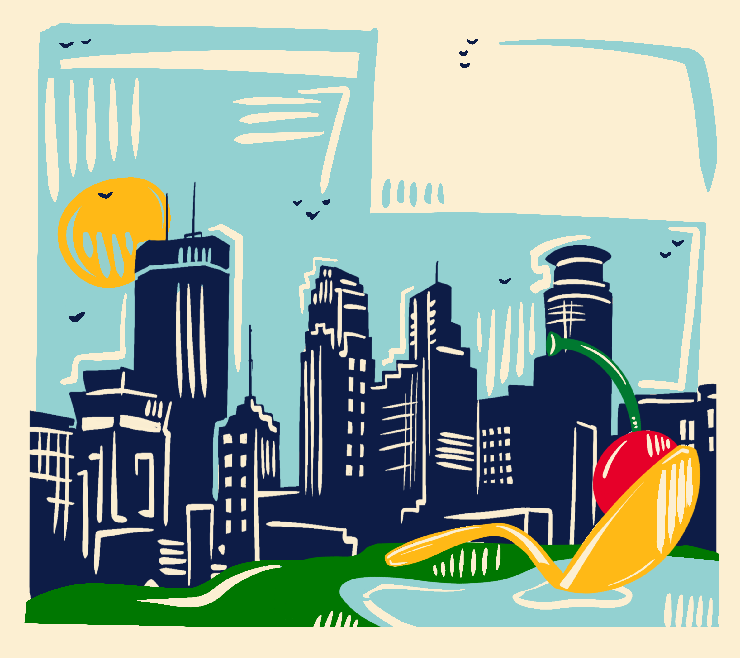
This project is deeply personal to me, as it represents the city I've called home all my life. My design embodies my vibrant perception of this place, reflected in a color palette that prominently features two shades of blue—an unexpected nod to my former club softball team. The illustrative style of my design is inspired by the Walker Art Center, the city's foremost art museum, known for its bold contemporary pieces and the iconic Spoonbridge and Cherry sculpture located in its sculpture garden. For typography, I selected Comrade Bold and American Typewriter; Comrade conveys the playful essence of my illustrations, while American Typewriter provides a grounded, clear presentation of information. My logo, inspired by the Spoonbridge and Cherry, captures a lively aspect of Minneapolis culture. Initially, I designed a loon as a logo, but it felt too generic compared to the vibrant symbolism of the sculpture. The cover of my brochure expands on this logo, but the most challenging aspect was designing the inside. I felt that photographs wouldn’t do my vision justice, so I opted to illustrate the featured landmarks—an unconventional choice for a city brochure, yet one that I believe authentically represents the spirit of my city.
